
Portfolio Update - September: Market Stumbles, Alpha Improves
One of the series we provide on our premium service is the monthly portfolio update. Since we’re posting the September update, I’ve removed the paywall from the entire August Portfolio Update.
Main Points
- Who doesn’t like even higher Treasury yields? Most investments. Anyone who wants less national debt.
- SUI gets highlighted as the AFFO multiple fell substantially during the year. Near-term headwinds are present, but it’s still a great REIT.
- REXR provided an update on acquisitions and a new presentation for shareholders. Transparency is even better with their latest presentation.
- AMT, SBAC, and CCI presented at a recent Goldman Sachs event. I’ll provide notes, but it comes after the Portfolio Update.
- I moved to a slightly more defensive stance. A bit more cash. Prefer fixed-to-floating shares with early float dates over fixed-rate or shares with a longer fixed period.
To keep things simple for our investors, the portfolio update is divided into several segments. The recurring segments are:
- Foreshadowing Potential Trades
- Trade Alerts (links to trades)
- Returns to Date on Open Positions
- Returns on Recently Closed Positions
- Returns on Total Portfolio
- CWMF’s Portfolio Images
- Sector Allocation
- Conclusion
- Strategy (Repeated) - This explains how we invest. It helps investors understand why we place the trades we do.
Foreshadowing Potential Trades (New Section Begins)

This section is usually prepared shortly before publishing. The goal is to quickly cover ideas for trades. We aim to foreshadow our trades here, though the market may move in surprising ways. While the article takes days to prepare and documents prices and performance from the end of the month, the potential trades section is written last to provide the most up-to-date pricing.
Based on the change in relative prices as of 09.07/2023, here are some of the trades on my radar.
Note on rates: I believe a significant portion of the weakness in share prices is a direct reflection of elevated interest rates. On July 31st, 2023 the 10-year Treasury had a 3.96% yield. Today (September 7th, 2023) the 10-year Treasury is at 4.276%. The 2-year Treasury increased from 4.879% to 4.974%. That’s technically higher, but it’s not really material.
Housing REITs: Still cheap. Even cheaper than before. I’ve been vocal about being interested in Sun Communities (SUI), Camden Property Trust (CPT), and Mid-America Apartment Communities (MAA). Sun Communities suffered the most lately and the AFFO multiple has been falling:

That’s a big disparity. SUI was regularly trading near the upper end for multiples. Even in early 2023, they had the second-highest multiple. Then shares fell hard.
To provide an alternative method for comparing the swing, I put the data for average multiples and current multiples into a simple chart and sorted it by the change in multiple:

Clear enough?
While SUI has short-term headwinds to AFFO growth (interest rates and some challenges in the United Kingdom), that’s also factored into the value for forward AFFO. We’re not charting using trailing AFFO. Consequently, this is a lower forward estimate and a lower multiple.
Towers: I’ll have more work on the towers coming up soon. I still think the market prices are much too low on these REITs. (AMT), (SBAC), and (CCI) presented yesterday at the Goldman Sachs Communacopia conference. I’ll have notes to share on that, as well as working on our models. However, the Portfolio Update comes first.
Industrial: Rexford (REXR) has taken the lead at $53.61. Yesterday (September 6th) REXR provided an update on acquisitions. Acquisitions all look good. This is exactly what we expect from REXR. Today (September 7th), REXR posted a new investor presentation. Leasing spreads are lower in Q3 2023 (from all-time record highs), but still materially above the implied second half guidance. Remember that leasing spreads for a short period such as a single quarter or even half a year can be influenced materially by which leases are expiring. Some properties will have better leasing spreads than others.
REXR added some data that I love to see. This is excellent transparency.
This kind of information was a pain to try to calculate without internal data:

REXR also began offering multi-year transparency on the mark-to-market for upcoming leases. That’s outstanding!

They even gave analysts a boost by calculating how much those increases would increase FFO per share:

This is a concept I’ve been trying to share with investors for a long time, but it’s much easier with the chart.
That’s why I can be so confident in projecting substantial growth in AFFO per share for REXR over several years. I expect market rents will continue to trend higher due to the emphasis on e-commerce over retail. Since e-commerce requires 3 times as much industrial space (no retail shelves to stash the product), the shift to e-commerce drives rents higher. This chart is based on a scenario where market rents are simply frozen at current levels.
The rest of the article is below the paywall.
Foreshadowing potential BDC trades
I’m not expecting to be active in the BDCs at the moment. Depending on volatility, it could happen. If I see Scott buy something or we see significant underperformance by one of the shares in the bullish range, then I might put some capital to work here.
Foreshadowing potential mortgage REIT trades:
The most likely trade would be to nibble on a bit more Ready Capital (RC).
Foreshadowing potential preferred share trades:
A month ago, I wrote:
I’ll be checking relative prices frequently. There’s plenty of opportunity for volatility here. Volatility is generally seen as bad, but it can be great when similar shares change prices at different times. We look for those opportunities to swap between shares and enhance returns. This is certainly an area I could be active in. Based on the way interest rates have been moving lately, I’ll probably have a preference for fixed-to-floating shares with earlier reset dates. I’ll still consider others, but if discounts to targets are roughly similar (say within about 2%), then I’ll be more likely to pick a share that floats sooner. That’s not a hard rule, just rough guidance for how I’m looking at things today.
What happened? We picked up some PMT-B (PMT.PB) after the announcement from PennyMac Mortgage Trust (PMT) about planning to turn their fixed-to-floating shares into fixed-to-still-the-same-fixed-rate shares.
In early September, I closed my position in FBRT-E because Treasury yields kept climbing and the preferred share yields kept falling (higher prices).
I’m still looking at adjusting exposure. Until the trend higher in Treasury rates stops, I’ll favor closing out fixed-rate positions. My fixed-rate positions currently are RC-E (RC.PE) and PMT-C (PMT.PC). PMT-C has a bigger discount to targets and a bigger yield based on PMT-C at $18.31 and RC-E at $19.31, so I’m more likely to hold onto PMT-C. However, all actions will depend on market prices.
I closed out our position in FBRT-E (FBRT.PE) at prices between $20.30 and $20.32. Shares are down to $19.70 today though, which is a more favorable price.
I’ve had my eye on RCC (RCC) and RCB (RCB). Fairly stable prices and strong yields to maturity. However, the bid-ask spread can be big and a significant portion of the yield to maturity comes from the difference between market prices and the $25.00 due at maturity. Consequently, any movements in or out of shares should be pretty gradual to avoid bumping prices. When a bond matures in about 2.5 years, moving the price 1% can move the yield to maturity by about 0.4%. Note: Those are rough numbers. At a yield of 9.3%, the baby bonds would be much more attractive than at a yield of 8.3%. That swing in yields only requires a swing of about 2.5% to 3% in market prices.
I’ll be keeping my eye on opportunities to buy fixed-to-floating shares. Looking for any decent dips in the prices to bump up the yield. I’ll be particularly interested in shares that will float within the next 20 months. In general, sooner is better. The market has shown a clear trend to focus more on floating yields as the date approaches. The market does not efficiently price shares based on projected future cash flows.
Since the market seems to enjoy making that mistake, I’ll incorporate a bit of that bias also. If two shares were undervalued by the same amount, the better buy would be the share the market is more likely to overvalue in the future. Especially in the near future. This is where things get weird for shares like AGNCM (AGNCM). The floating spread isn’t great. It shouldn’t be great. It doesn’t have a huge discount to targets. Regardless, if shares are priced at a similar yield to NLY-G (NLY.PG), then they would need to climb by more $1.00 in less than 8 months.
There isn’t a good way to handle that for price targets. Fundamentally, AGNCM “should” have a bigger discount. However, if we figure investors will probably be able to dump the shares near $25.00, that results in a great return profile as a shorter trade. We have a similar challenge with a baby bond. If a baby bond matures in a month with a 20% yield to maturity, the discount to targets would still be small. Even if that bond had excellent credit quality, the discount to targets would be small. The fixed-to-floating shares absolutely do not have the same level of safety as a baby bond, but absent a recession, the floating-rate shares have a tendency to trade around $25.00 when the floating-rate is about to start or shortly thereafter.
If we assume efficient markets, then price targets are the best guide. If an investor wants to buy and log out for 2 years, price targets and risk ratings are the big factors. If they are looking to trade more actively, then there should also be some level of bias in favor of shares that will float sooner. However, the investor willing to trade would still (usually) want to dump the shares and reallocate if prices move near $25.00.
I expect to follow this pattern with my trades because the market has demonstrated such an overwhelming preference for shares that are going to float in the very near future. I’ll be biased in favor of shares that float sooner. I wouldn’t buy them at any price, but I’d be willing to pay a moderately higher price-to-buy ratio for a share that floats 6 months sooner.
Note: The preferred share tab has more categories in column R now. “FTF” for “fixed-to-floating” was insufficient to recognize the difference between which shares are more or less likely to float.
Impact of Rates
Higher Treasury yields are a big factor pushing many other investments down. It’s more difficult to argue for any investment when the yields on 5-year TIPS and 10-year TIPS are so high. When Treasury yields moved from 1% to 1.8%, that wasn’t really going to be a big deal for most stocks. As they continue to increase, it creates a much more significant pressure. Due to compounding on public debts, each 100 basis point increase in Treasury rates becomes more significant.
We strive to remain politically neutral and encourage investors to do the same when discussing investments (at least within our platform). Political investing is emotional investing and emotions are inherently not rational. Being rational in our investment decisions is important. Unfortunately, most sources are designed to elicit emotional reactions because it leads to content being shared more frequently.
Higher interest rates have a negative impact on inflation in the short-term, but they also lead to printing more money. What caused inflation? Was it the big balance sheet at the Federal Reserve? The one that did basically nothing to stimulate inflation for a decade? No, that wasn’t it.
If the definition of insanity is doing the same thing and expecting different results, what do we call doing the same thing for a decade then claiming it had a vastly different result?
Inflation can be increased two ways:
- Cut supply (which happened)
- Increase demand (happened dramatically through deficits)
The difference between financing $31.5 trillion of debt at 2% and 5.33% (effective fed funds rate) is an increase of $1.05 trillion in annual interest expense. For comparison, prior to the pandemic, there were only 4 years (great financial crisis) where the deficit was greater than $1.05 trillion. If the existing debt was all marked to 5.33%, then interest expense alone would be greater than the total deficit for most prior years.
I expect to see some pressure on near-term inflation. Household savings are drying up. Student loan payments will cut into disposable income for many families. Huge rental rate increases have been passed through to almost all renters now, so monthly expenses were already going to eat into purchasing power. Those factors should help with inflation.
However, I expect deficits to grow substantially over the next decade regardless of which team has control. Interest expense is compounding the problem. Consequently, looking over the next 10 to 20 years, hedging against inflation becomes very important. One way to do that is through real estate. Share prices are a bad hedge in the short-term, but over longer periods real estate benefits from new leases, which drive greater cash flow. Because the value is driven by cash flow, they are also assets producing income for the shareholders.
Note: The short-term disparity in the price performance of single-family home REITs and single-family homes demonstrates how share prices are a poor short-term hedge. Share prices plunged during the pandemic. Home prices did not. In the recovery, share prices ripped higher far sooner than home prices. If we expand our view to include apartments, some were flirting with 52-week lows. However, if you look at cash flows to the investors, you see a stream that increased with inflation.
Trade Alerts
Below you’ll see links to our trades from the month:
- 8/15/2023: RCA matured, which closed the position. There is no trade alert because there wasn’t a trade.
- 8/17/2023: Trade Alert: CCI, SUI, RC
- 8/28/2023: Trade Alert: PMT-B
- 9/6/2023: Trade Alert: FBRT-E
Note: The Portfolio Update took a bit longer to prepare this month. We ended up with an extra trade for early September. It isn’t included in the images below because the images are a snapshot as of 8/31/2023.
Returns to Date on Open Positions
We will start with the open positions as of the end of the month. It often takes a few days to prepare this article, but the screenshots below are from the end of the prior month.
The cell with the ticker is grey if the position is in a taxable account. This was a request by a few members and there was no drawback to adding the information. All of those positions are in equity REITs.
Some tickers are highlighted in orange. That’s because I discovered a typo in my sheets during the portfolio review. Any line with a correction has the ticker in orange.
Preferred shares and baby bonds:

Equity REITs:
Mortgage REITs and BDCs:

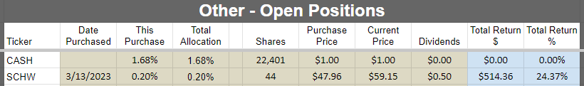
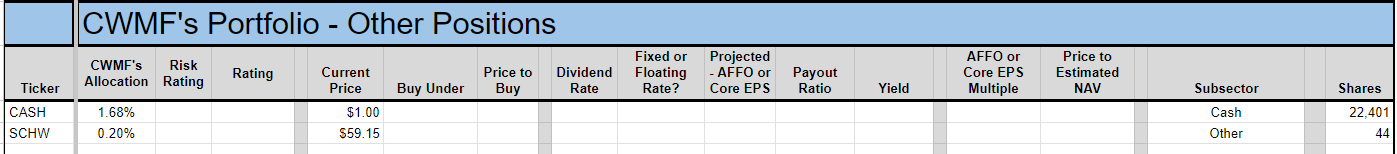
Other:
Returns on Recently Closed Positions
These are the positions closed since the last portfolio update. If you want to see positions that were closed before that, you can see the prior portfolio updates or use the Google Sheets. If we didn’t close any positions for the sector during the month, then the image will be blank. Note: By loading the Google Sheets, you can still see all of our closed positions. To reduce the size of the huge article, we’re only highlighting the recent changes.
Preferred shares and baby bonds:

Equity REITs:

Mortgage REITs and BDCs:

Other:

Total Portfolio Returns
Our performance since we began preparing for The REIT Forum at the start of 2016 is shown below and runs through the end of the latest month:
Here are our results through 08/31/2023:

We thoroughly beat the four major indexes covering our types of assets:
- MORT - Major mortgage REIT ETF
- PFF - The largest preferred share ETF
- VNQ - The largest equity REIT ETF
- KBWY - The high-yield equity REIT ETF most retail investors follow
Annual comparison vs. each ETF:
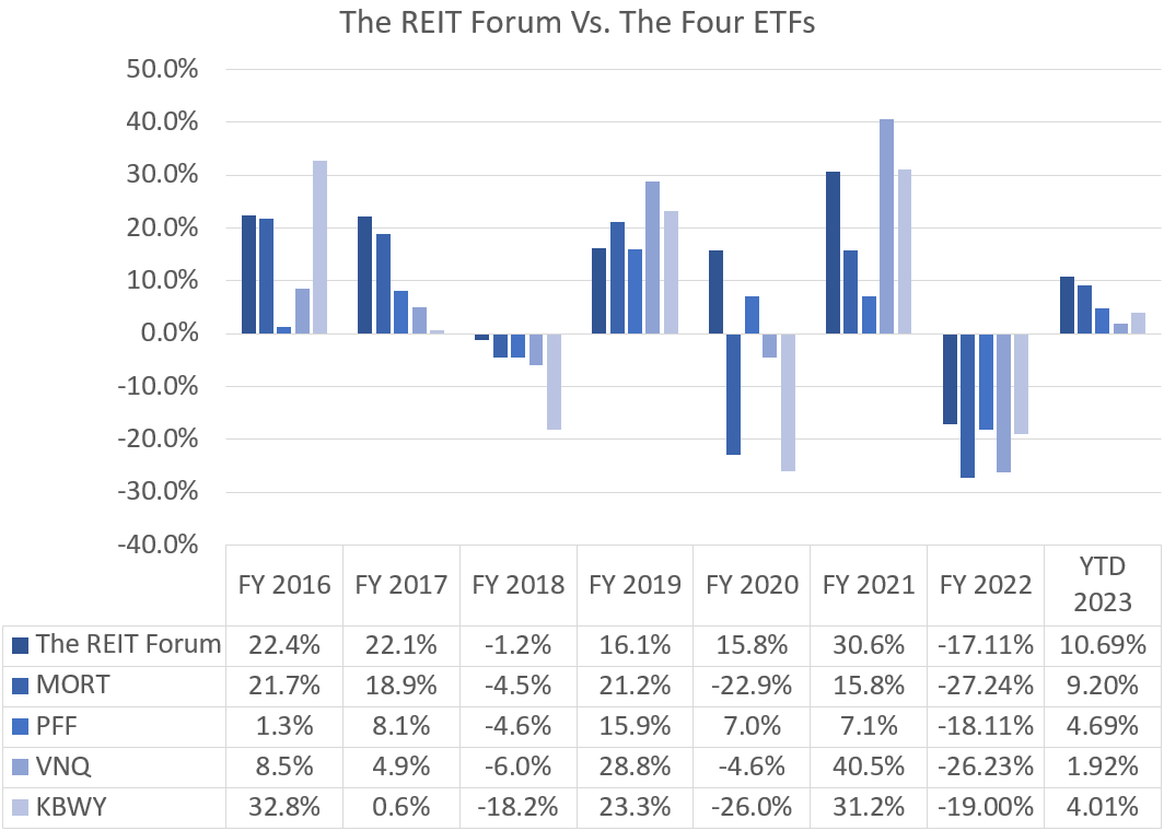
We’re still ahead of all four of the index ETFs we track. That’s great.
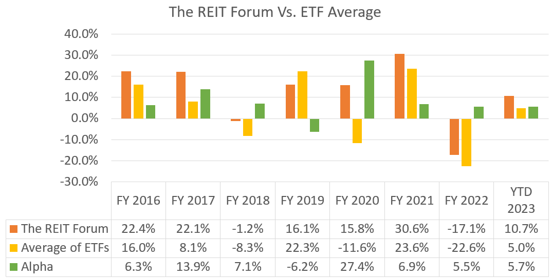
The market stumbled in August. We saw a small dip. Not even 1%. That was quite a bit better than the averages for our sectors. The outperformance brought our alpha year-to-date up to 5.7%.
The next chart shows the change in the value of our portfolio from month to month. We strip out the impact from contributions made during the month because obviously, contributions are not returns.
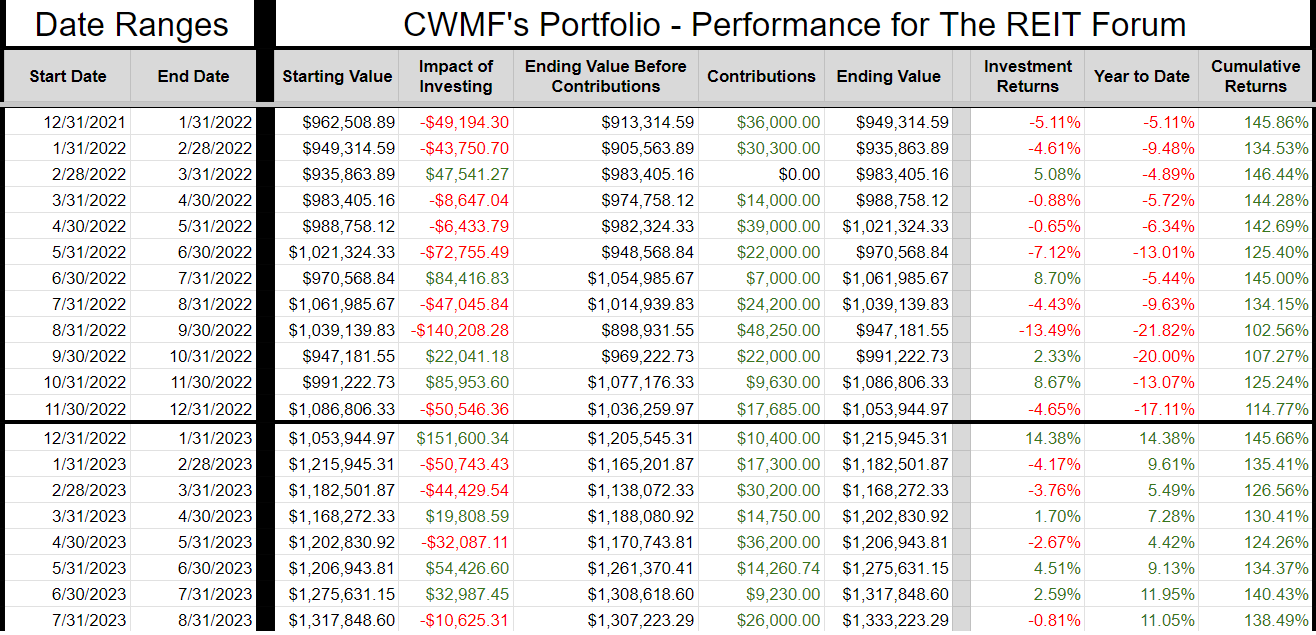
The prior year is included as well to help investors see how the calculations work. You can always access this tab, with our entire record, in the REIT Forum Google Sheets. It is called “Returns Chart” and it is the tab all the way to the right.
Time for a note on returns. We strive to be transparent about returns. When I was reviewing the values, I noticed they weren’t matching my Schawab portfolio value as closely as they should. Sometimes Schwab has a slightly different closing price for some securities, so I ignore tiny differences. However, the difference was a few thousand instead of a few hundred. Upon investigation, I found that my share counts for DX-C and RC were off. Trade alerts were accurate, but the number of shares recorded had a typo.
I’ve corrected the sheet. I also corrected the ending portfolio value for the prior months using the number of shares and the actual ending share price for that month.
Consequently, I prepared an extra table to show the change:

Returns were enhanced because we found another 397 shares of RC that were missing from the sheets via typo. This was just a case of typing 312 twice when the second row should’ve had 709 shares.
CWMF’s Portfolio Images
These images use the data from the end of the month.
Preferred shares and baby bonds:

Equity REITs:

Mortgage REITs and BDCs:

Other:
Sector Allocation Chart
The sector allocation chart helps to explain how we are thinking about risk and seeking returns:

Conclusion
Several good equity REITs for long-term investors. I may put some additional cash into the equity REITs. These are long-term positions so the quality of the underlying company is critical. We’re generally accepting some near-term headwinds (such as those created by interest expense on floating-rate debt) to get a low multiple on REITs we expect to deliver great long-term growth rates.
For baby bonds, be very cautious about bid-ask spreads. A modest movement in prices has a material impact on the yield to maturity.
For preferred shares, I will favor fixed-to-floating shares over fixed-rate shares due to the recent trend in Treasury rates. If that trend reverses, my opinion may change as well. Any intelligent opinion should be based on facts, so it should change when the facts change. The Treasury rates are a significant fact that will change every day. When it changes far enough, it triggers a reevaluation. I may increase my fixed-to-floating positions with a preference for shares that float in under 20 months. All else equal, sooner is better. This will cause me to occasionally pay a higher price-to-buy ratio on the expectation that the floating rate will push prices higher for a better (and earlier) exit opportunity.
Consequently, I may swap from shares that have a longer period before floating or fixed-rate shares into fixed-to-floating shares that will float sooner. Price-to-buy targets are designed around longer-term investors with an emphasis on effectively valuing future cash flows. However, for near-term trading opportunities, it would be wise to consider the price-to-buy targets and the time left until shares begin floating. Since we’ve seen a clear failure in pricing develop several times, it just makes sense to look for opportunities to exploit it.
Finally, I would remind investors to make use of short-term Treasury ETFs. These are a perfectly suitable replacement for cash if you expect to know you’ll need it a few days in advance. I would normally keep at least 6 months (often more) of living expenses in cash. If you normally keep around $40k to $50k, the difference between getting paid 5% and 0.2% is around $2k per year. I’m using (SGOV) and (SHV) as my cash substitutes. Another good option is (BIL). When cash is needed, I’ll transfer it from the brokerage account over to regular checking.
Note: I use a separate account for holding this cash. It doesn’t get factored into my portfolio. It is functionally a checking account, but it is technically a brokerage account capable of owning shares. There are some alternatives for money market funds as well. Just beware leaving significant amounts of cash in a near-0 yield checking account.
Strategy (Repeated)
For new subscribers, we should emphasize that we often treat our positions differently. We have those we consider as being primarily “Trading” positions and those where we prefer to “Buy and Hold”. A simple way to remember it is that anything with a high risk rating is probably going to be a trading position. Most of those high-risk positions are mortgage REITs and BDCs. These are two very challenging sectors where most investors (and “analysts”) simply don’t get it. Analysts who can’t predict the changes in book value for mortgage REITs or NAV for BDCs aren’t in a position to trade them. Analysts who don’t know how to evaluate the probability for dividend cuts (or raises) are in a weaker position for trading them. We have access to a great analyst (Scott Kennedy) who delivers exceptional estimates and price targets. If we only bought and never sold, we couldn’t reallocate to take advantage of the next disparity in valuations.
When we switch over to equity REITs, we usually have a long time horizon for investments. We’re thinking more about growth in AFFO per share and the long-run outlook for the sector. Consequently, we will pick REITs with lower risk ratings. The risk rating on an equity REIT correlates heavily with how much debt the REIT is using. That isn’t the only factor, but the correlation is strong. When debt levels are high, that alone can be a sufficient reason to assign a higher risk rating. Consequently, you’ll see us trading equity REIT positions far less actively. We will mostly wait for opportunities to buy a great REIT at an attractive price. We simply don’t want the mediocre equity REIT, not even at a low price. It doesn’t fit our strategy.
Preferred shares can be used in either way. However, you’ll often see our positions listing a “short” holding period. That’s because we frequently swap between different preferred shares that are at least roughly similar. For instance, we might sell NLY-F to buy NLY-I, then sell NLY-I to buy AGNCO, then sell AGNCO to buy NLY-F again. Why would we do that? They each have a risk rating of 1, trade at roughly similar prices, and will carry similar spreads when they begin floating. So what are we doing? We’re taking advantage of a change in the relative prices. By the time we’re back to the initial share, we are able to have more of them. If each time we traded between those shares we ended up with a 1% increase in the share count, we could end up with 3% more shares of NLY-F at the end of that trade than at the start. That leads to faster growth in the total portfolio. It appears that we’re selling the preferred shares quite often, but frequently it is just a change between two similar shares. We do this when we’ve found the spread in prices is large enough to let us exit one position and enter the next.
This may be different from the methods you’ve seen employed by other analysts. You may have joined us because you became tired of mediocre results. Our better results have been a function of our unique strategy.
Member discussion