
Jerome Powell and the Oh Noes Nonfarm Payroll Report
We’ve had three negative developments for Treasuries. Each contributes to sending Treasury yields higher:
- The Nonfarm Payroll Report on Friday
- Powell says bearish things on 60 minutes.
- The ISM (Institute for Supply Management) report came in high, which supports higher rates.
We’re going to focus on the Nonfarm payroll report, which was the driving factor on Friday.
My Expectations
Same as before: Don’t expect a series of several rate cuts this year unless we fall quickly into a severe recession. The market was optimistic about interest rate cuts, but Powell’s Board of Governors is not looking to lower rates. They are looking for excuses to keep rates higher for longer.
Treasury Yields Move Higher on Friday
The Treasury market took a hit on Friday. Yields jumped dramatically higher as investors reacted to the nonfarm payroll report.
The headline numbers look scary. Especially to people who were already scared.
Terrible Numbers
The market reacted to a few data points.
Let’s use Seeking Alpha’s news blurb to highlight some crap.
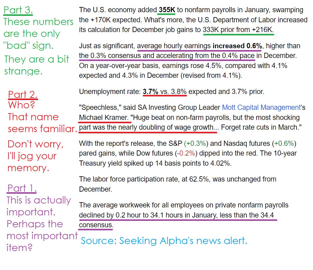
We’ll go through those items in the order I labeled them, which is the opposite of the order Seeking Alpha used.
Part 1: Hourly Earnings are Up
The funny thing about hourly earnings is that it gets impacted quite a bit by hours worked. It is, after all, a ratio.
Average hourly earnings were “up” by 0.6%. Actually, it was 0.552%, but why not round when the actual data is already present?
The consensus forecast was for 0.3% growth (actually 0.252%). So that’s horrible for inflation, right?
Quick question. When you buy items, do you pay with cash or with an hourly rate?
I’m joking. We all use credit cards to get cash back, but the point stands.
Inflation is primarily driven by changes to supply or demand.
Note: Due to monopolies, changes in “supply” can be a bit tricky.
Time for A Table
Words are awful. Tables are great.
Here’s a table for the data we need:
Sure, the table is ugly. I said tables are great, not beautiful. The table gets the point across.
The only value within this data set that was “above” the consensus estimate was the average hourly rate.
All 3 numbers missed the consensus forecast, but not all in the same direction.
The consensus forecast overestimated hours worked and overestimated total wages (the thing people actually spend).
That doesn’t support the case for “demand” driving inflation.
The weekly wages were lower than economists forecasted and ever so slightly lower than the revised values for December.
Calculating Average Hourly Rate
Total wages / Hours Worked = Average Hourly Rate.
Because hours worked dropped by even more than wages, it resulted in a higher hourly rate.
There you go. That’s how you get a “doubling” of wage growth. You get a slight reduction in hours worked and it tweaks the ratio.
Part 2: Who Was Speechless?
Perhaps you’re not familiar with that author. He’s become very popular (or at least visible) on Seeking Alpha because the news links his work frequently and it’s entertaining to watch the perma-bear be wrong.
Think of it like Gilligan’s Island, except with money on the line.
Here’s one of my favorite headlines:
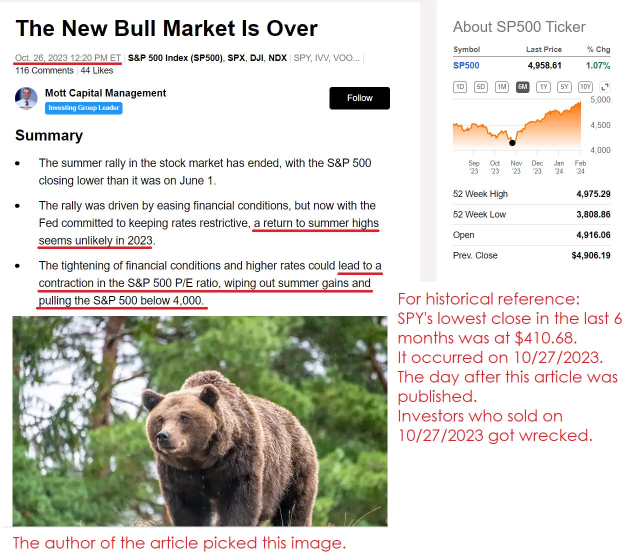
Source: Seeking Alpha
How did that play out? The S&P 500 (SPY) is pretty close to 5,000.
Does that bear in the image like new record highs?
The beauty of this wrong call is that it is wrong on each part of the premise.
- The S&P 500 rallied past summer highs.
- The “tightening of financial conditions” saw the 3-year Treasury yield fall from 4.879% on that day to 4.25% as of today (was under 4% occasionally).
- Earnings are not ripping higher. Instead, we’ve seen an increase in the P/E ratio.
- Clearly, the S&P 500 is pretty close to 5,000 and very far away from 4,000.
- The call was published the day before the absolute lowest close before the rally took off.
It was perfect(ly wrong).
Well, if this goes public on Seeking Alpha, it will have to be a censored version.
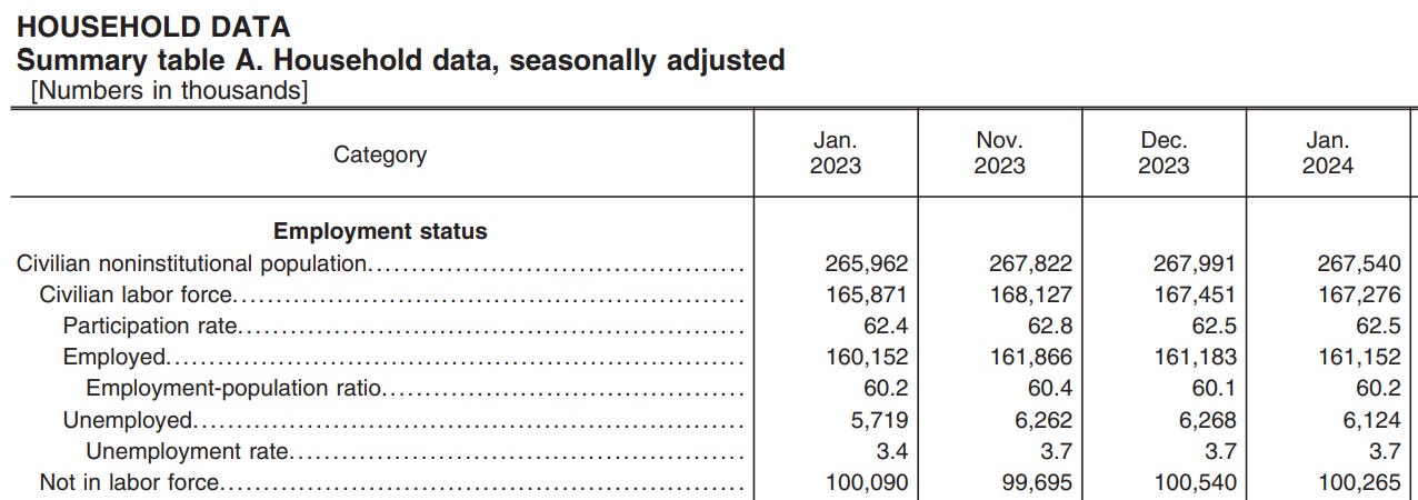
Part 3: How Did The Economy Add 353,000 Jobs?
The BLS (Bureau of Labor Statistics) proves that it happened, maybe, with this super convincing table:
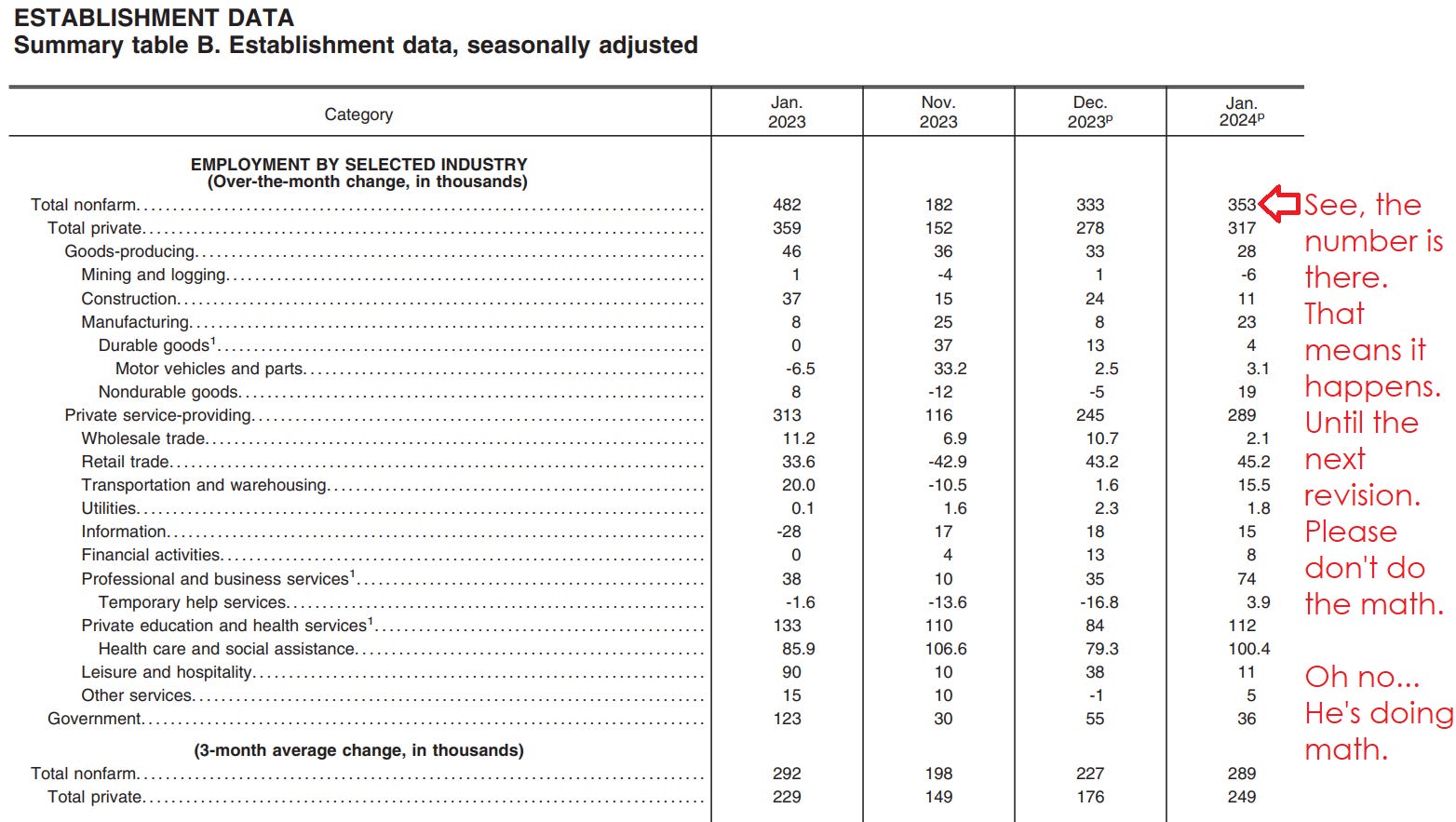
Now, you might wonder if this chart would be contradicted by any other data sources that were also published in the same report.
How about this chart?
That’s pretty nice, right?
But what kind of idiot would cut off the percentages so early? If we’re going to make a big deal about a change of 0.1, then we should stop rounding to 1 decimal place. That’s stupid. We should never round to a number where a single point would be a big deal.
We’re going to do some grade school math.
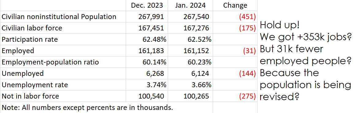
Well, the participation rate actually went up. The unemployment rate went down, but rounding eliminated a change of 0.08%.
What if the unemployment rate had dropped from 3.75% to 3.64%. That would only be 0.03% further. However, it would suddenly round to a change of 0.2% (from 3.8% to 3.6%) rather than rounding to a change of 0.0% (from 3.7% to 3.7%).
Now, you might be inclined to think “Wow, quite a few people died.”
However, this is the impact of adjustments to the estimated population for any number of reasons. Of course, the population changes over time.
Yet, these adjustments won’t impress:
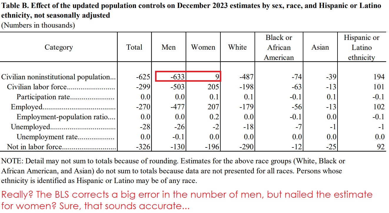
No, this isn’t the BLS reclassifying a bunch of existing people from one column to another. We didn’t lose 633,000 men that way. Turn off the politics channels. We’re talking about 633 thousand!
Most of these men were in the labor force. They had jobs. Most of those jobs require social security numbers. We should have a much more precise estimate for this number.
Retirement wouldn’t remove them from existing. Not unless this is some dystopian future where retirement means death.
Recap
There are officially another 353,000 jobs, but there are fewer employed people. The margin of error for the population is significantly larger than the number of jobs added. While immigration isn’t always tracked effectively, we’re talking about jobs that are officially reported. Jobs that usually involve a social security number. We should be able to have a pretty good count for that number.
While all those “jobs” were added, the average working hours and weekly wages declined. We could attribute that to an increase in part-time jobs which have lower hours worked and lower weekly wages, but they often have lower hourly rates as well. That’s a weak explanation.
Should we really say wage growth doubled when weekly wages were down? Some of this may come down to the reliability of the data. If the data is reliable and if small changes matter, we probably shouldn’t have the hours worked rounded off so early either. Overall, I’m not particularly confident in the data.
However, I’ve been telling investors for several weeks that the market was probably too optimistic regarding rate cuts.
Market Forecasts
The chart below shows the implied rates (and therefore the implied cuts) through the December 2024 meeting. You’ll see the implied rates as of today, as of a week ago, and as of a month ago.
You’ll notice the market is shifting its perspective.
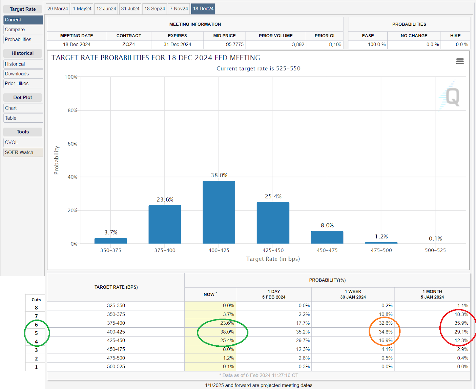
Source: Fed Funds Watch, some elements added by author.
I think 6 cuts would be an unlikely outcome. Unless we dive into a recession, I suspect 3 to 4 with a small chance of 5.
If we dive into a recession, it may be harder to forecast. Typically we would expect rates to drop immediately, but that expectation has been based on a period where the Federal Reserve was not significantly concerned about inflation.
Of course, these views may change over time as new data comes in.
Conflicting Points of View
The hard part here is reconciling between conflicting points of view. On the macro side:
- The market was probably too optimistic regarding rate cuts. I suspect it still may be too optimistic.
- The path forecast by the market would probably be better monetary policy than the path I think the Federal Reserve will end up taking.
- If there is a recession, we could see rates cut faster. However, the credit spreads on corporate bonds and P/E ratios imply that the market believes a recession is quite unlikely.
- Rates moved higher following these developments. I’m not surprised by higher short-term rates (fewer cuts), but these developments were not worthy of being the catalyst.
Investment Strategy
If the market is wrong about rate cuts, then the forward curve is a bit too low.
The Federal Reserve controls short-term rates. Therefore, the one-year Treasury yield should be a near-perfect mirror of the expected fed funds target rate over that period.
We could be overweight cash while waiting for more opportunities to appear. Nothing wrong with being a bit overweight on cash with yields this high.
If we enter a recession, that could turn out nicely. Especially if we enter a recession where the Federal Reserve refuses to adequately cut rates. That’s a possible future.
On the other hand, if the market is right about no recession, then there are some nice opportunities to pick up higher yield. The spread to junk bonds isn’t great. But we could play with the fixed-to-floating shares that have upcoming floating dates. Assuming no recession and short-term rates only declining slightly, many of those shares should trade around call value. Quite a few would probably trade above call value. The yield to call can be quite attractive. Further, we often find some opportunities to swap between shares to squeak out a better total return.
If we have relatively steady short-term rates and no recession, then I think this strategy provides an excellent risk/reward profile.
The worst case scenario would be entering a recession (credit spreads widen) with the Federal Reserve aggressively cutting rates (floating-rate dividends falling).
Consequently, I would want to hedge against that worst-case scenario by playing primarily with shares that have lower risk ratings (where credit spreads should expand less).
Upcoming
I’ll be working on the Portfolio Update. It’ll be relatively short as this piece covered the macro events and my strategy.
I’ve also got some earnings updates on the way:
Industrial REITs: Rexford (REXR) reports after the market closes today.
Apartment REITs: Essex (ESS) and UDR (UDR) also report after the market closes today.
Apartment REITs: AvalonBay (AVB) , Camden Property Trust (CPT) and Equity Residential (EQR) all reported recently.
I’ve also got a piece coming up on SBA Communications (SBAC) to highlight my largest position.
There is also an upcoming piece that covers a mistake I made with interpreting inflation. It’ll probably be the most engaging piece on inflation you see this year.
Thanks for reading.
If you enjoyed this piece, consider tapping that heart icon.
Member discussion