How About Those NLY Preferred Shares?
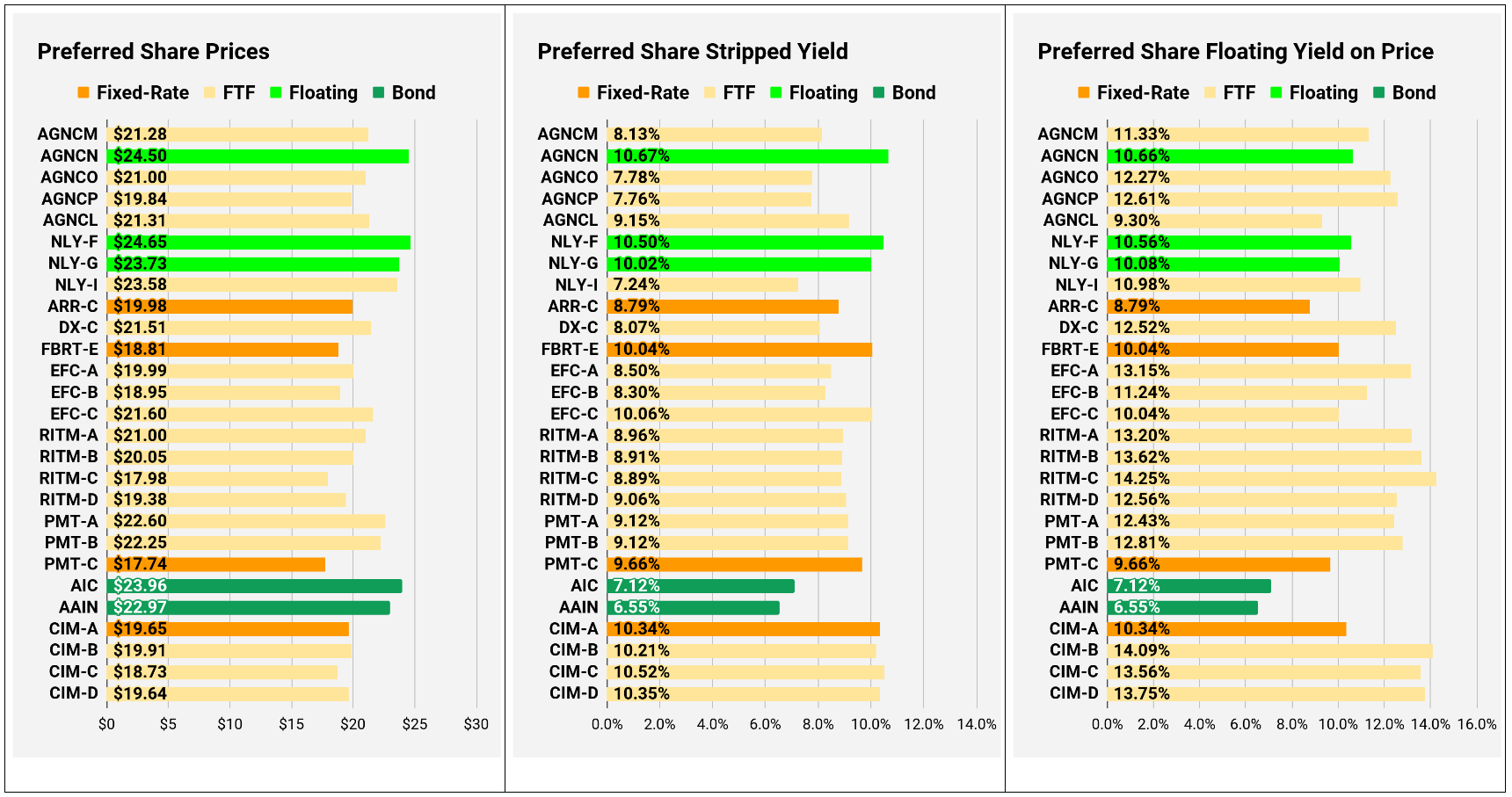
I’ve written about Annaly Capital Management’s (NLY) preferred shares many times. In late 2022, it was a point we were hammering because the relative prices were so severely distorted. Today, the valuation of NLY-I and NLY-F is remarkably comparable:

NLY-I begins floating on 6/30/2024. That means we have 5 dividends left to go.
The quarterly dividends for NLY-F (already floating) should be, on average, about $.20 to $.22 higher than the fixed-rate dividends for NLY-I ($.42 per quarter).
When NLY-F and NLY-I are both floating, the rates will be extremely similar. The difference will be a tiny fraction of a penny. Since NLY-F has 5 quarterly dividends that should be about $.20 to $.22 higher on average (vs NLY-I), NLY-F should pay out about an extra $1.00 to $1.10 in dividends over those 5 quarters. The difference in share prices today is $1.07. That’s between $1.00 and $1.10. Therefore, the current price spread is remarkably efficient.
Proponents of an efficient market may suggest that nothing is surprising here. However, history tells a different tale. Valuations were dramatically different during Q4 2022.
The following chart shows how much needed to be invested in any of these shares (with dividend reinvestment) to have $100,000 today. You’ll notice there have been a few periods where the lines dramatically disconnected:
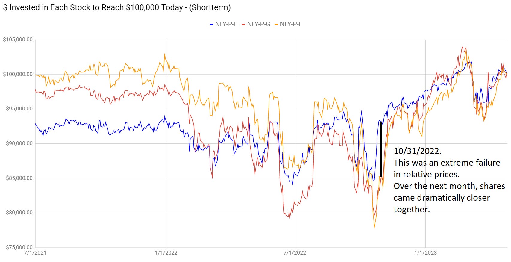
That gap at the start of the chart makes sense because investors didn’t expect a dramatic increase in short-term rates at that point. As the Federal Reserve demonstrated they absolutely would hike to the extent of creating a recession, short-term rates went higher, and the projected cash flows changed. However, by 10/31/2022, the short-term rates were already up dramatically, and the forward curve was set. The necessary information already existed, but many investors were ignoring it.
The Irony
You can see how the NLY-I and NLY-F are priced efficiently relative to each other. Compared to NLY-F, the yield on NLY-G is about 50 basis points lower. If short-term rates decrease (as expected over the next two years), that hurts NLY-G more than NLY-F because a larger portion of NLY-F’s floating dividend comes from the floating spread (4.993% vs. 4.172%). Therefore, the only viable argument for NLY-G today is the idea that NLY-G has less call risk than NLY-F and NLY-I. That argument is fundamentally true; NLY-G does have less call risk. However, the market isn’t applying that same logic to the preferred shares from AGNC. For AGNC, shares with less call risk (due to a smaller floating spread reducing the odds of a call), are not getting premium valuations based on projected cash flows.
That really cuts into any arguments about NLY-G deserving to trade at a lower yield because of the reduced call risk.
For investors who think there’s a dramatic difference in the risk level, I’d suggest comparing AGNCN and NLY-F. The market is valuing those 2 floating-rate shares as if they are largely interchangeable.
Due to the difference in valuation throughout the AGNC preferred shares, we have a large position in AGNCP. We also own a smaller position in AGNCO.
Residential Mortgage REIT Charts
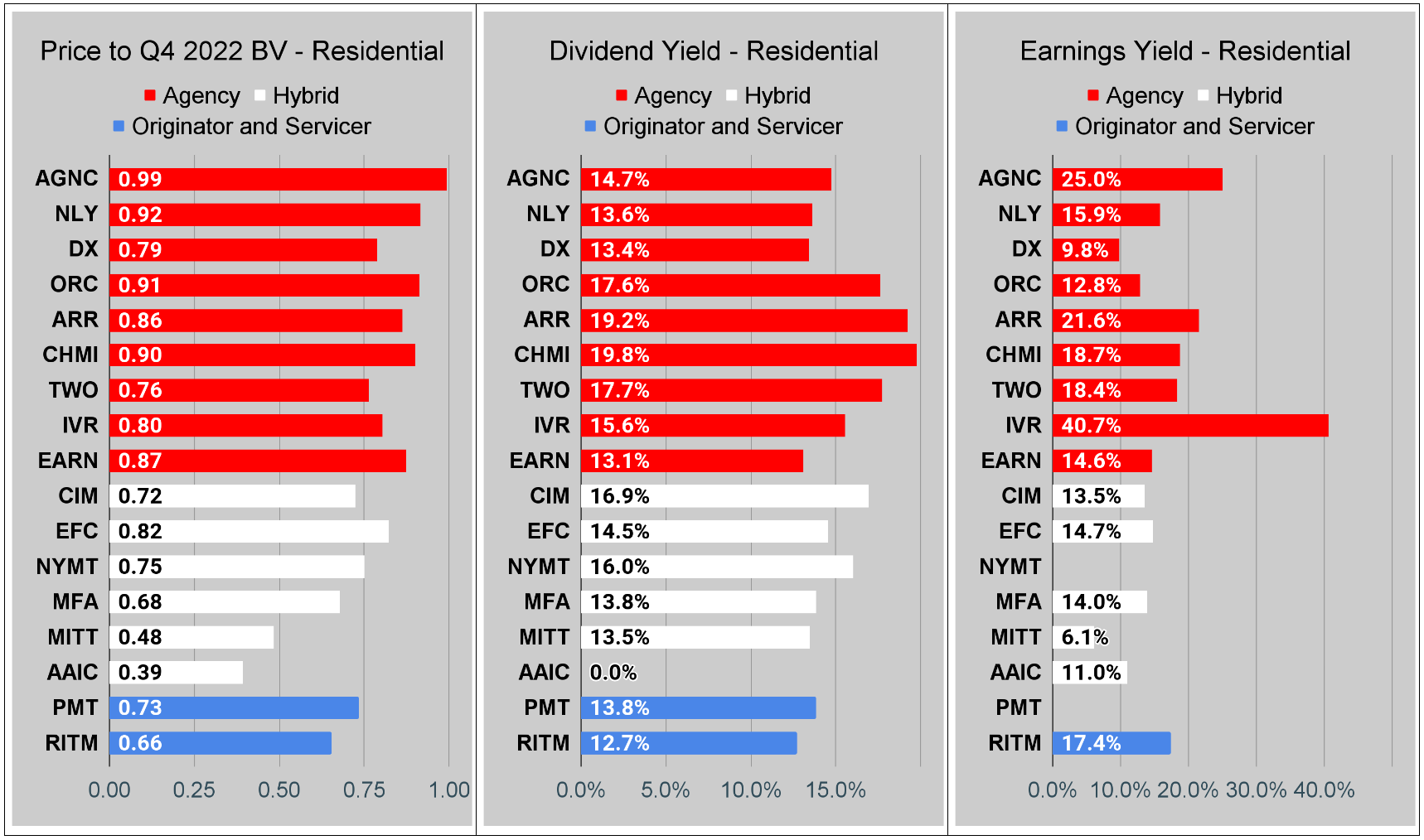
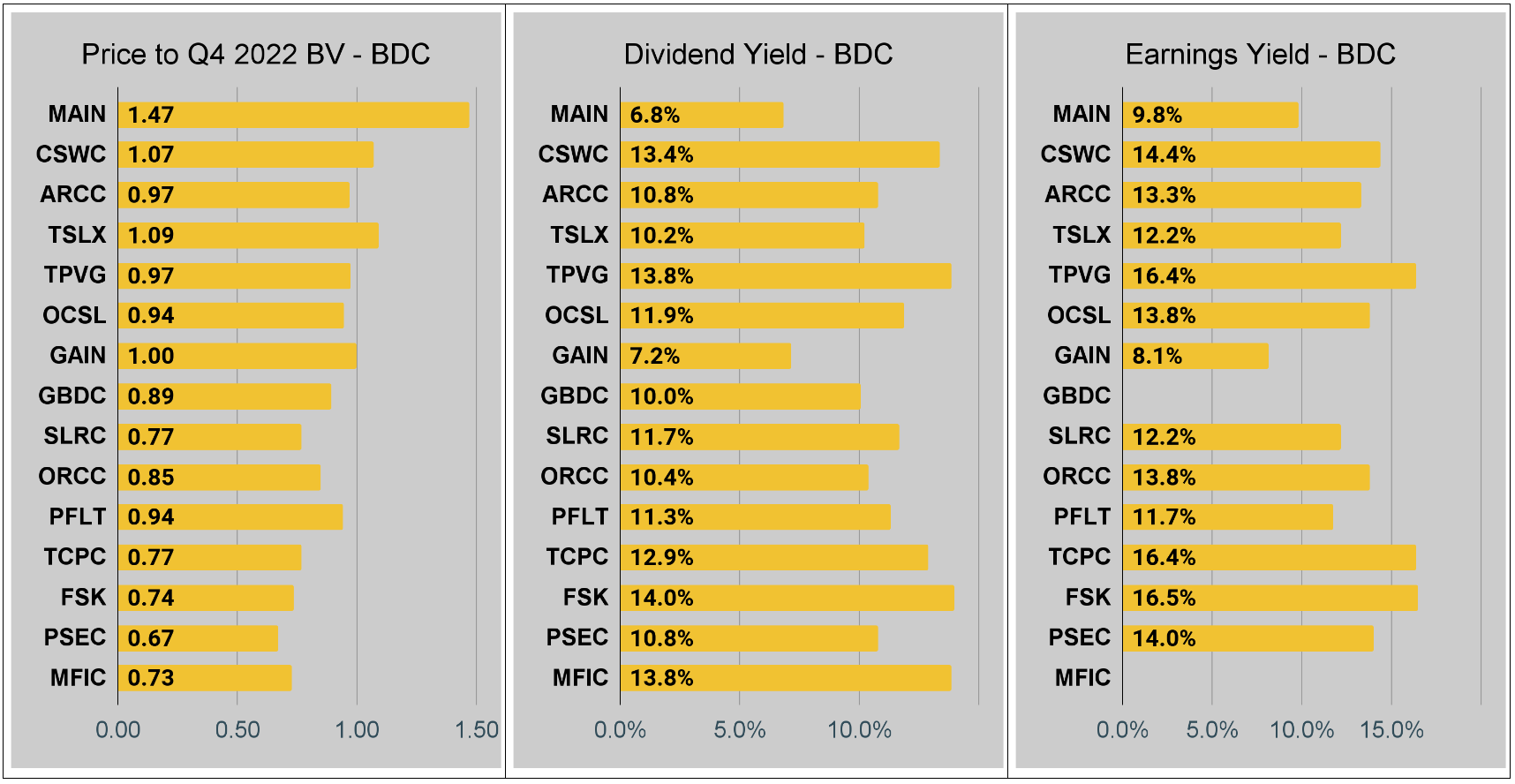
Note: The chart for our public articles uses the book value per share from the latest earnings release.
The current estimated book value per share is used in reaching our targets and trading decisions. It is available in our service, but those estimates are not included in the charts below. PMT and NYMT are not showing an earnings yield metric as neither REIT provides a quarterly “Core EPS” metric.
Second Note: Due to the way historical amortized cost and hedging is factored into the earnings metrics, it is possible for two mortgage REITs with similar portfolios to post materially different metrics for earnings. I would be very cautious about putting too much emphasis on the consensus analyst estimate (which is used to determine the earnings yield). In particular, throughout late 2022 the earnings metric became less comparable for many REITs. It remains far less relevant today. You can see this clearly by looking at the earnings yield for DX compared to AGNC and IVR. This is one of the weaknesses in how “Core EPS” metrics are designed.
You can click on any of these charts to zoom in. Due to some technical limitations, it has to zoom in all 3 charts for each sector at the same time.
Commercial Mortgage REIT Charts

BDC Charts
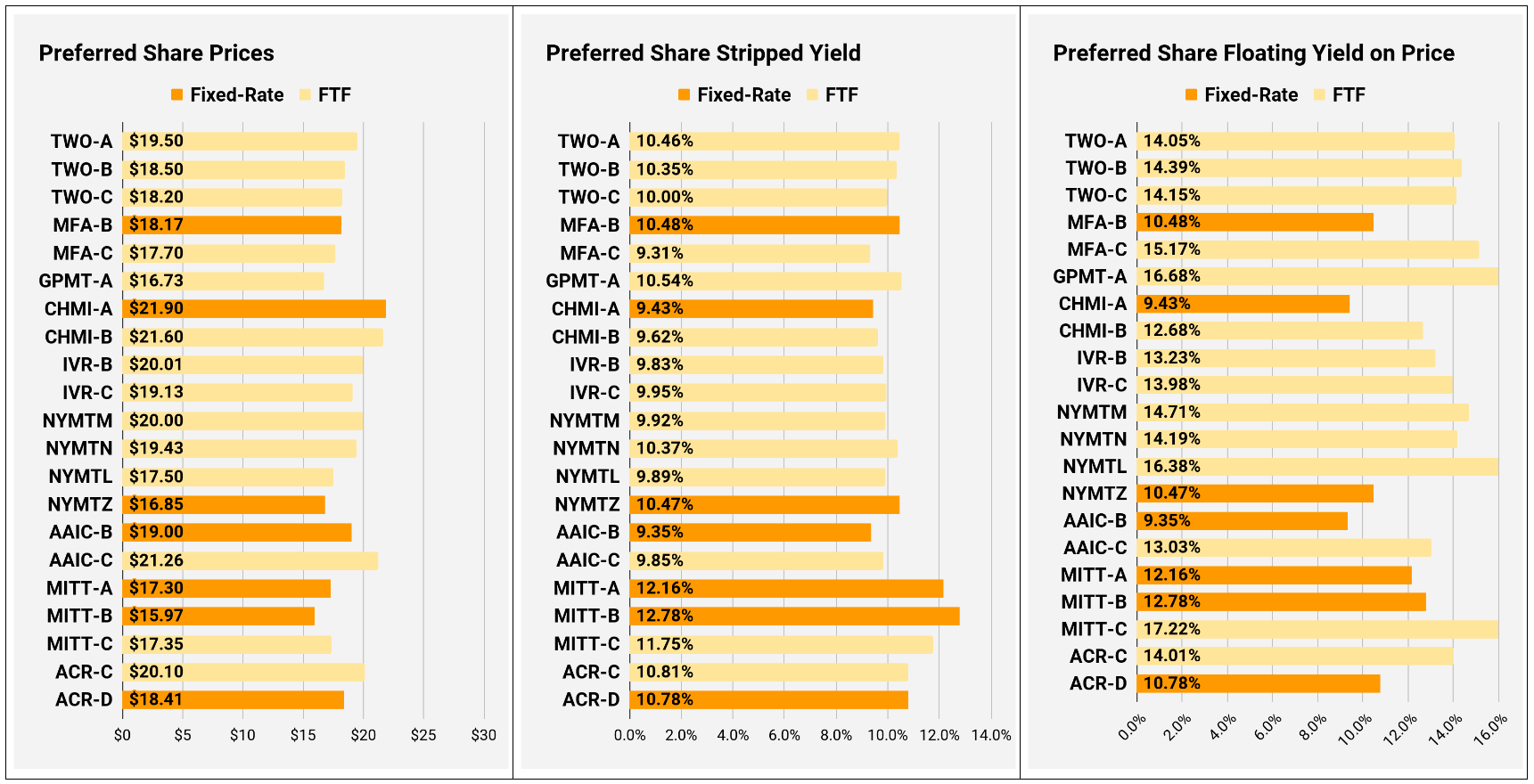
Preferred Share Charts
I changed the coloring a bit. We needed to adjust to include that the first fixed-to-floating shares have transitioned over to floating rates. When a share is already floating, the stripped yield may be different from the “Floating Yield on Price” due to changes in interest rates. For instance, NLY-F already has a floating rate. However, the rate is only reset once per 3 months. The stripped yield is calculated using the upcoming projected dividend payment and the “Floating Yield on Price” is based on where the dividend would be if the rate reset today. In my opinion, for these shares, the “Floating Yield on Price” is clearly the more important metric.
Conclusion
Thank you for reading.
Our website is still pretty small, despite offering the same quality that draws in tens of thousands of paid page views on Seeking Alpha. We would love to see it grow. If you know someone who would benefit from our articles, please share the article to them:
If you’re seeing our articles here for the first time, sign up to receive new articles (for free) by e-mail:

Member discussion