
Guide To The 100k Charts
- We have a charting technique we like to use for looking at changes in REIT valuation.
- The charts we are using are built around the end date for the chart, rather than the start date.
- This charting system allows us to gather more information at a glance than traditional charts would allow.
- These charts help us to evaluate relative movements in prices. Spotting these changes in relative valuation makes it easier to pick entry/exit points.
- The charts also enable investors to judge relative volatility at a glance. Reducing risk is a major factor in generating long-term returns.
Note: This is an article I prepared a long time ago. I’m using the same images, but I’ve enhanced the descriptions.
When investors chart stock returns, they generally pick a starting date and an ending date. This is how all investors learn to read charts. However, it is only one technique. We want to discuss another technique. Reading another kind of chart is precisely like learning to use another tool. Too many investors only learn one tool.
Considering Alternatives
When investors become too focused on one approach, they may miss alternatives:

(Source: Medium)
The Law of the Instrument
The law of the instrument is the official name for the problem. When investors have only one tool at their disposal, it can shape the way they look at problems:

Investors who are only familiar with approaching a problem from one angle will put themselves at a disadvantage.
The Concept of Charts
It may seem like a silly section, but this is another important concept. Some investors will argue that the price change is completely irrelevant (only evaluating income). We aren’t saying that investors need to monitor the share price constantly, but it is a major factor in total returns. A stock with an unsustainable dividend often sees the share price begin falling well before the dividend is actually cut. On the other hand, consistent dividend growers will often see their share price continue to rise.
When reviewing our prior choices, we like to measure the relative performance of similar stocks. Even if investors don’t consider themselves “traders”, they need to consider the importance of the change in value over long periods.
If investors are interested in trading, then the price change becomes even more important.
The Most Common Chart
Investors who are checking the price history of a stock will often use a chart like this:
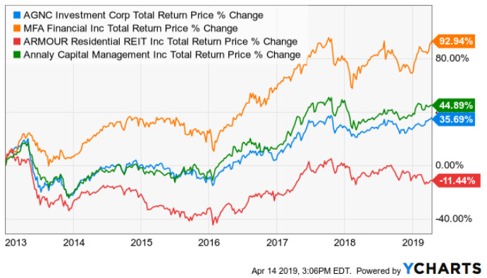
This kind of chart can be useful if you want to check how the investment has performed since 1/1/2013. If you want to evaluate a different entry date, you’ll need to draw a new chart.
Try a simple question. Which days would’ve been better for buying Annaly Capital Management (NLY) rather than MFA Financial (MFA)?
An investor using this charting strategy would be left plugging in several dates to check. The weakness of this chart is that it overemphasizes the starting period. Which date is more relevant to you?
- 1/1/2013
- Today
If you care about today, you want a chart focused on prices relative to today.
Our Alternative Chart
Since we’re focused on prices relative to today, our chart is designed to have the lines converge on the right instead of the left.
We’re asking how much needed to be invested in any of those shares on any given day (using the closing price) to reach $100,000 today. For simplicity, we assume dividends were reinvested.
We’re going to start with the simplest concept:
Which dates could an investor have purchased shares to earn a positive return, assuming they still own the shares (as of the date the chart was prepared)?
See the chart below:
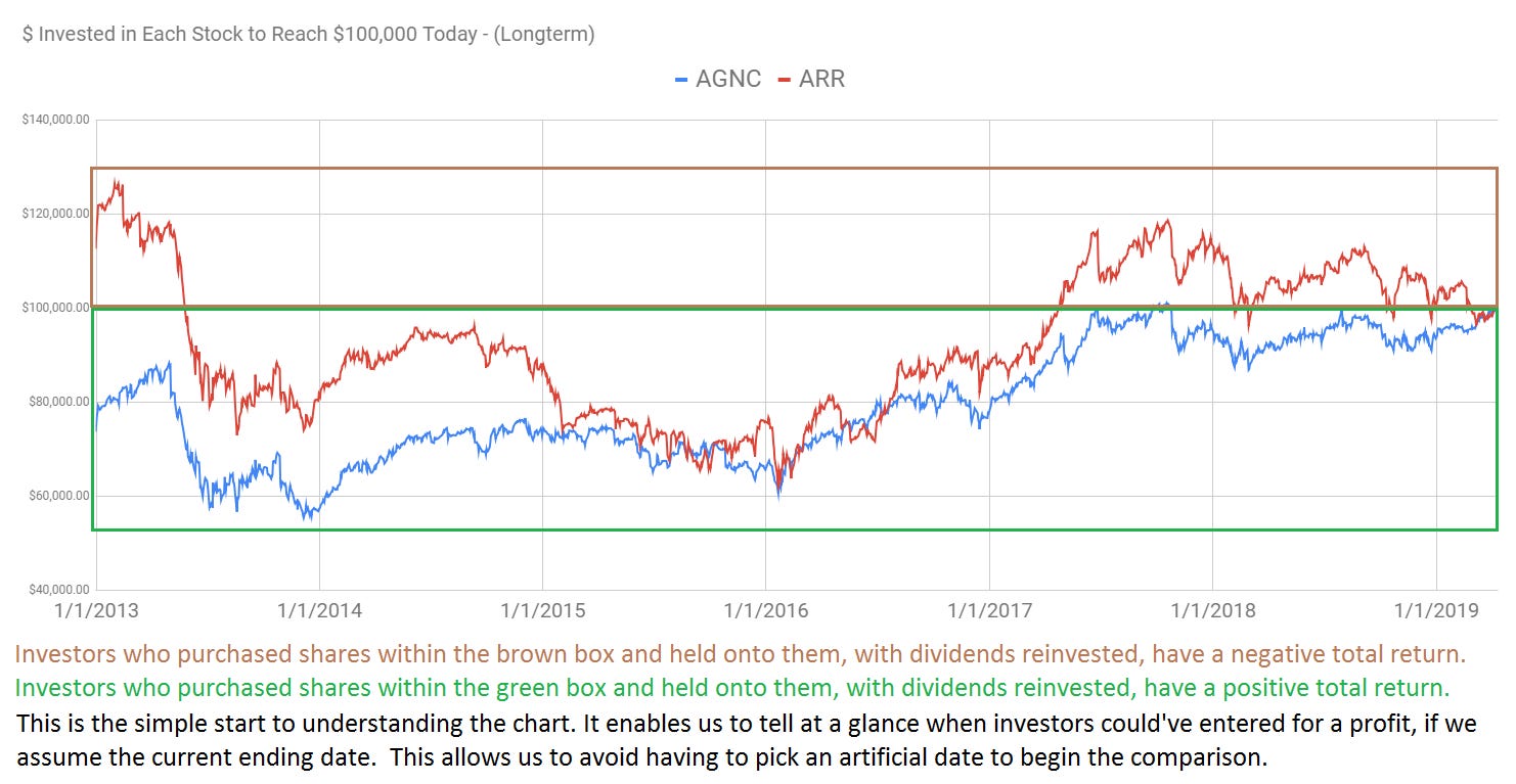
Unlike most charts, a single glance gives you the history of performance based on any entry date for over 6 years. That’s much better than having performance based on only one starting date!
Comparing the Performance of MFA vs. NLY
In the chart below, we’ve used black boxes to demonstrate the dates where an investor buying NLY would outperform an investor buying MFA on the same date:
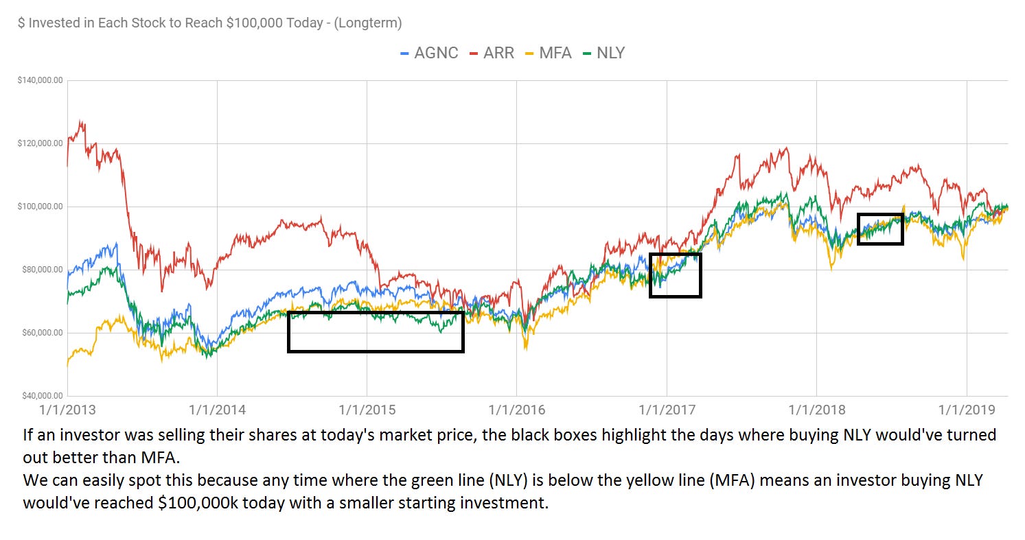
The chart is built to use the latest closing prices for the current value. Consequently, it demonstrates performance based on an investor who bought the shares and still has the position open. Unlike the common charts, this chart enables investors to ask themselves: “What if I had purchased on a different date?”
On a traditional chart, the entire chart must be redrawn. However, we can simply scan across the dates in this format.
When was ARR Not the Worst Choice?
Try a similar question using ARMOUR Residential REIT (ARR).
We can tell at a glance which entry dates would’ve allowed ARR to outperform at least one of their peers charted below:
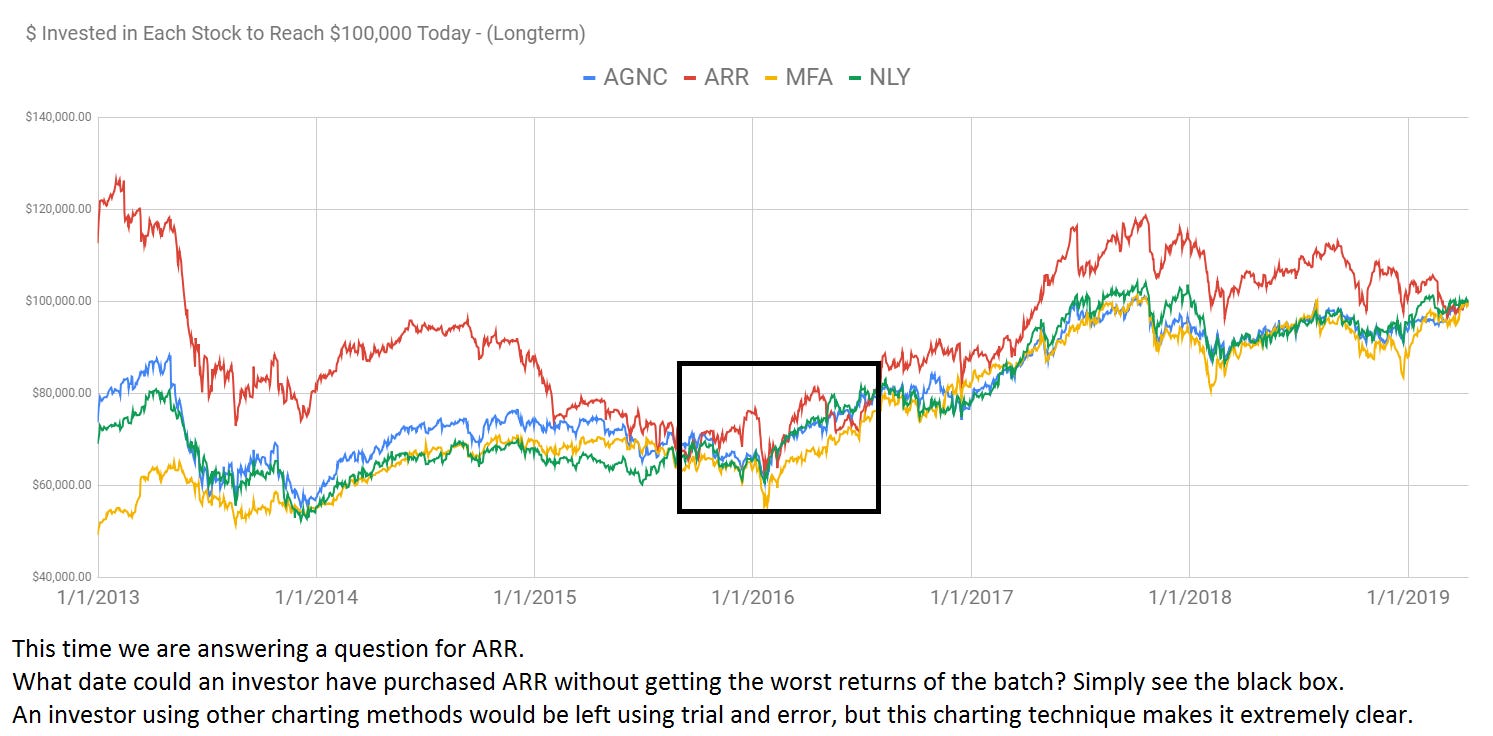
If the investor still owns the shares (as of the date the chart was prepared) and didn’t purchase them during that black box, they earned the worst returns available among those 4 shares. This is important because an investor who bought at the start of 2017 would still have a positive total return. However, it would be the weakest among the peer group.
If the investor bought outside that black box but sold shares when prices spiked, they still may have done extremely well with them.
Easily Evaluating Calls
The following chart gives investors an easy way to check when analysts should’ve had sell ratings on ARR:
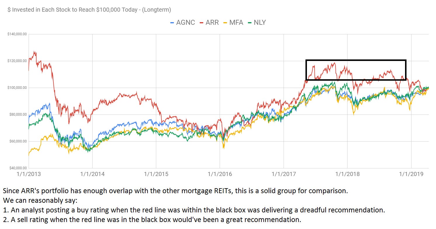
Of course, no analyst will be right all the time. We’re not right 100% of the time. It would be an impossible standard. However, ARR has enough overlap with these REITs for a solid comparison. Investors who bought AGNC Investment Corp. (AGNC), NLY, or MFA during that black box are either up or roughly even. Investors who bought ARR are down significantly.
Relative Valuations
One area where this charting technique excels is relative valuations. Even though the chart is simply showing the price change (adjusted for dividends), the emphasis on the ending price (the most recent closing price) makes it easier to evaluate movements across the sector. For instance, we had some pretty big calls on Capstead Mortgage Corporation (CMO), which are highlighted below:
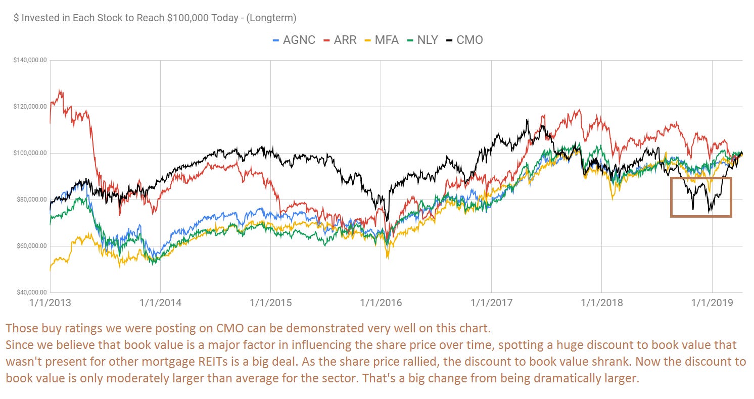
Even though there were several periods where an investment in CMO would’ve turned out poorly, the emphasis on comparing price-to-estimated-current-book-value throughout the sector enabled us to spot the opportunity.
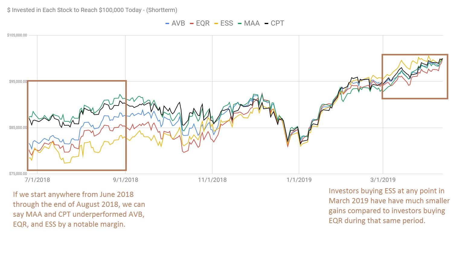
We can shift to apartment REITs and monitor the sector movements in the same manner. This time we’re going to highlight where the sector dipped hard from late 2017 through early 2018:
We can also zoom in on a smaller time period to get a better look for more recent observations:
When Does Charting Help With Relative Valuations?
The chart doesn’t give investors the fundamentals. Instead, it enables us to spot when similar stocks are moving differently. That can draw our attention for further examination. For example, consider the following chart for 5 mortgage REITs. We’ve had rating changes for 4 of them recently and the chart demonstrates the price movements that drove those changes:
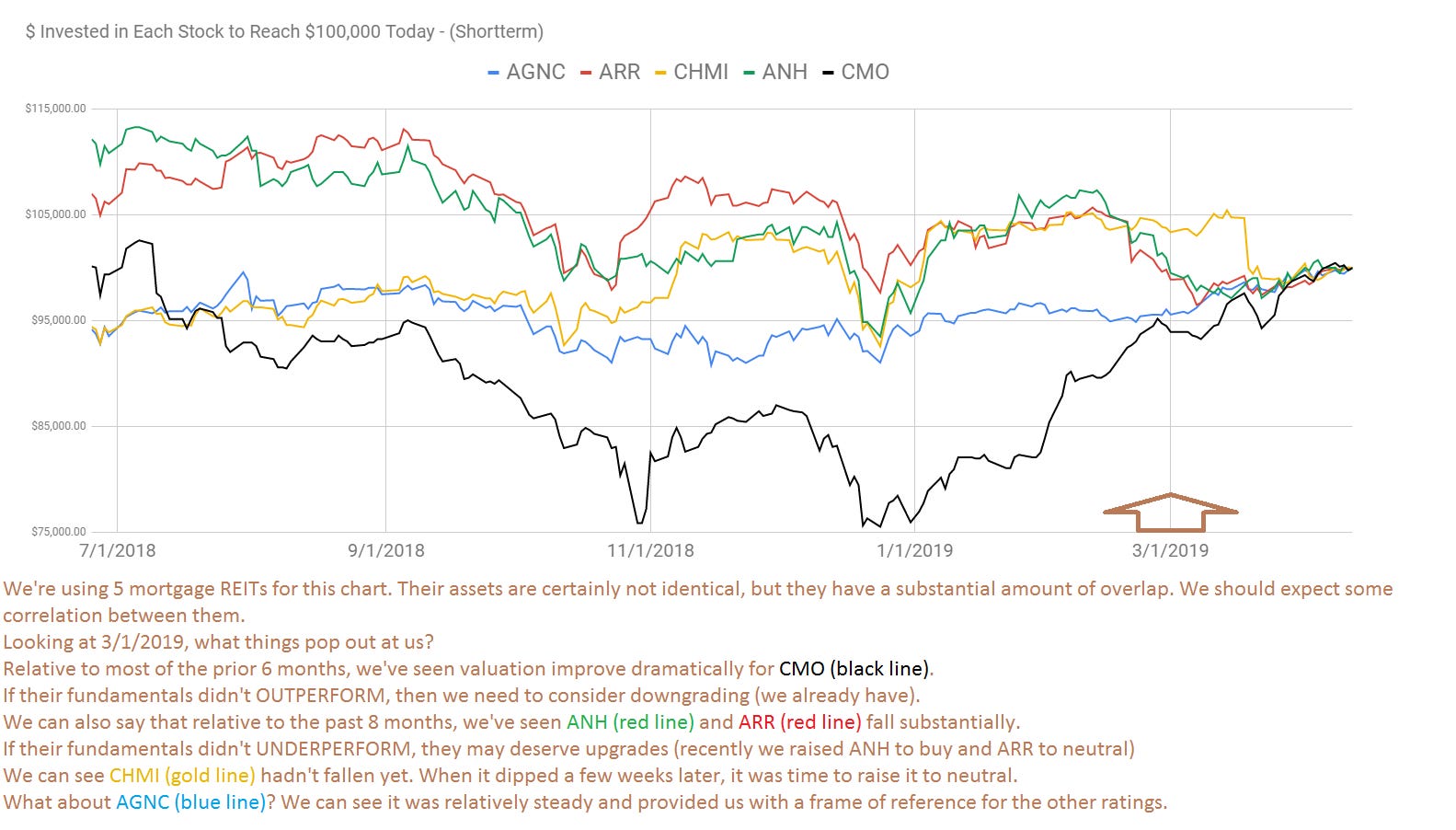
One key point to make here is that the ratings are going in the opposite direction of recent price history. We had upgrades for ANH, ARR, and CHMI. In each case, those 3 had very recently seen their share prices underperforming.
Scott Kennedy models changes in book value throughout each quarter. He shares his values with us. By modeling the change in book value, we can reasonably say that these 3 REITs should not be doing much worse on fundamentals. Simply upgrading shares because of a declining share price, without checking the fundamentals, would be very dangerous. Sometimes there is a good reason for a falling share price.
The fundamentals help us find where we believe the valuations should be. They also enable us to determine which shares are comparable and which are not. This is a critical distinction. Too many investors assume that different REITs are comparable without digging into their underlying assets.
What About Technicals?
Some investors may assume that this means we are disregarding technicals. That isn’t quite the case. It would make more sense to suggest that we are considering technical factors for peers. If we see most of a sector trending lower, that should be a huge warning sign for the REITs which haven’t moved lower yet. That could be a sign to change our position. We might buy one of the REITs that already fell, or we might just walk away from the position.
On the other hand, if we see much of the sector moving higher, we might want to enter a position in one of the REITs which remains on sale.
Different Levels of Similarity
When we discuss comparable valuations, it is important to remember the “comparable” part. Investors who struggle greatly with this concept might attempt to compare two dramatically different REITs. In the example below, we show two “shopping center” REITs. Aside from both being classified as shopping center REITs, they have virtually nothing else in common. Investors who tried to compare Federal Realty Trust (FRT) and Wheeler (WHLR) would’ve had a poor comparison. The chart makes it appear that FRT’s price hardly changed. FRT’s price certainly did change, but it looks tiny beside WHLR’s massive destruction of wealth:
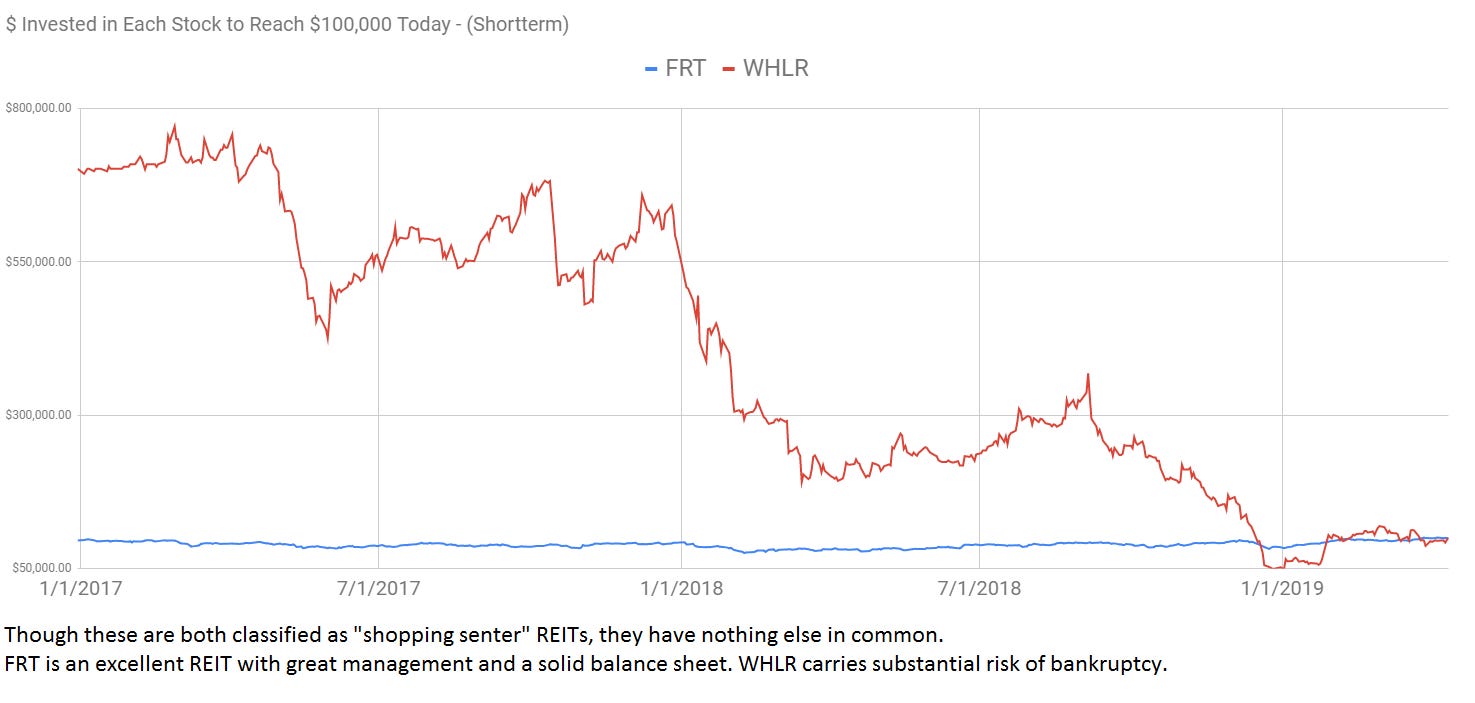
We can’t expect two REITs to be precisely the same, but we do need to ensure that they are actually comparable. Simply being listed within the same subsector is not enough. It isn’t even close to being enough. We need to evaluate the underlying assets owned by each REIT and the strength of their balance sheets. We also want to evaluate the quality of management. Poor management can wreck an investment thesis.
Relative Volatility
There is one more advantage to using these charts. They are incredible in demonstrating “relative volatility”. When investors (or even analysts) are comparing different investments, they rarely spend enough time evaluating the risk levels. This is an area where price history can be exceptionally useful.
Investments with little volatility in their history will rarely become highly volatile. It does happen, but it is less common than a volatile investment remaining volatile. While fundamentals can change, we’ve found shares with lower volatility in the past have often demonstrated lower volatility in subsequent periods.
That concept can be challenging for some investors. Think about it this way. If you purchase a 3-year Treasury, the price won’t fluctuate all that much. Interest rates may change, but with only 3 years to maturity and the United States Government backing the debt, you would expect changes in the market price to be quite small.
You would expect much higher volatility if you purchased a stock market ETF. Previously, the stock market has been more volatile than 3-year treasuries. You would know that the trend is very likely to continue. We can easily determine which will likely be more volatile without knowing how either investment will perform.
This same concept can be used when evaluating different investments. We use it extensively when discussing the difference between mortgage REIT common shares and mortgage REIT preferred shares. Consider the chart below to determine which investment is more volatile:
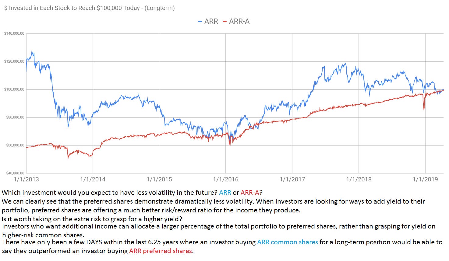
We can easily see that the preferred share is dramatically less volatile. It carries far less risk. Yet investors taking on more risk (and expecting more reward), have been left wanting. This is the major challenge for investors grasping for yield. Higher risk does not mean higher rewards, if it did, there wouldn’t actually be any risk.
Instead, higher risk only means what it says: higher risk.
While we utilize the mortgage REIT common shares for trading, the mortgage REIT preferred shares will offer a much better risk/reward for investors who intend to hold the position open for many years.
The preferred shares won’t always outperform over several years, but we can be confident in saying that they should be far less volatile. We should be constantly looking for ways to minimize risk. This is one of the best techniques we’ve found.
Conclusion
When you see these charts, remember that they are most useful when comparing similar investments. If the REITs are comparable, a sudden drop will often signal an upgrade due to lower share prices. Similarly, a sudden rise may signal a downgrade due to higher share prices.
The idea here is to capitalize on the correlation that should exist for similar investments. That correlation can help us decide when to place a trade, and thus when to send a buy alert or sell alert. Comparing several shares within a sector gives us a better view of the messages the market is sending.
When we are evaluating investments, the volatility should be considered as well. Investors willing to take on higher risk often expect higher rewards. In practice, the additional reward doesn’t always come. If it did, there wouldn’t be any risk. Investors planning a position should always consider risk as one of the most important factors.
I find these charts useful for supplementing the fundamental research for evaluating investments.
Member discussion